Cutting away….

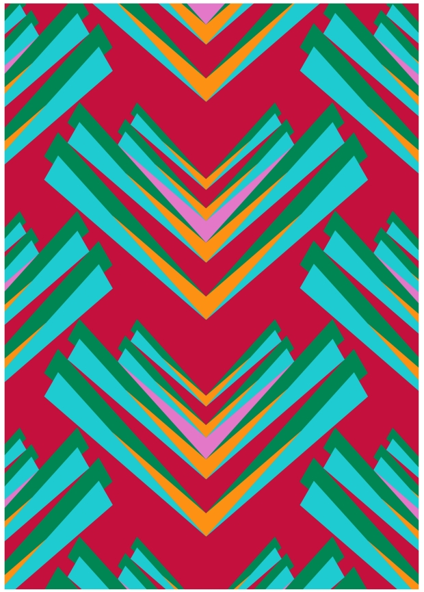
I’ve been trying make my work have a 3D effect by layering up different styles of work along with transparent materials.  I wanted to develop this idea futher so I’ve took the leap of cutting up a design!  The chosen one is this 1 meter digital print because it looks completely flat as it is….

image

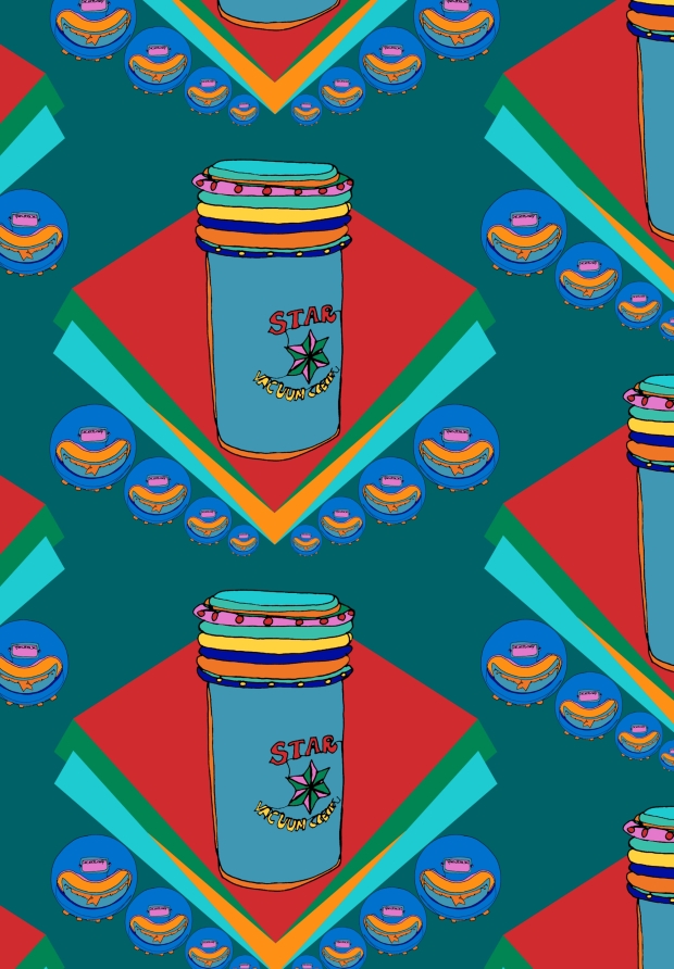
I wanted to try something different to what I have tried previously. I decided to cut away most the design to leave an outline of another; I chose the gas lamp print as I also wanted to see if I could manipulate this in a different way to what I have already tried.  So,  I drew out the design and started cutting!

image

It left some interesting marks… 

image

So far I can see how it’s going to come together when layered ontop of a screen print…

image

But you’ll have to wait to see the finished result! 

Artists Statement

The manipulation of something old into something new inspires me; looking at a contemporary interior surface design without firstly realising the imagery consists of wartime objects is my aim. This concept is due to my passion for exploring local history; my dad has had such an interesting life from working in Zambia to living in LA, but it is the nostalgic times of growing up in Newcastle which inspires me the most.

I focus on creating digital prints which have been inspired by my drawings of gas lamps, tinned food, old shop settings and like-wise imagery. In contrast to these bold and colourful designs, I also create loose mark making art with screen printing. Without exposing a design I can create loose, raw and textural prints. But, it is what I do with this combination of techniques which makes my work innovative.

I want to communicate my feelings as a designer through my work. So, by collaging modern bold motifs with gestural prints and photographs onto different layers gives the sense of ‘is there something more there’? I build up my work making is almost 3D-like as well as cutting away at it to leave gaps and layers behind the work; what’s behind that cellophane? Is it a photograph? Is it stitch? Another memory? Another story to be told? Even though this may not make sense to the viewer, my work requires the involvement of the audience to make it work. Each piece of my work tells a story which is intended to provoke both thoughts and an emotional response from the viewer.

I am currently studying BA(Hons) Textiles & Surface Design at Cleveland College of Art & Design where throughout the past three years I have exhibited at Premier Vision Paris and aim to display my work at New Designers 2016!

Major Development!

Last week I had my academic tutorial where me and my tutors discussed the idea of combining my digital work with my mark making experiments. So I have been trying out different techniques to do this….

Firstly, I gathered my digital work to see what I had to work with

image

My first idea was to manipulate the design of the gas lamps and jug by creating layers. The simple design of the gas lamps is quite cute so I wanted them to stand out. I tried collaging them with coloured cellophane and my mark making screen prints just to see the difference. But I didn’t just want to simply stick them onto the design,  so I used 3D foam sticky pads to create the idea of layers.

image

image

I also cut into the design to make layering behind. I think this works better in smaller areas.

To see the contrast,  I layered some lamps without editing them at all and tried different heights of foam squares and these also looked good.

I wanted to try this technique on a different design but in a different way for development purposes.
So, I printed a design with the layers showing and different levels of opacity to give the sense of layers again.  Then,  I cut up a repeat design to later on top.

image

To make it even more 3D I collaged on my marks using the foam squares which makes them stand out more.

Reflecting on this work,  I decided I needed to do more screen printing as alot of what I had left had white areas which I didn’t want, so back to the print room I went! 

image

I used one of my digital repeats as inspiration to create these marks.

To ensure no white came through the print, I pulled the screen though numerous times in different directions by changing the angle of the screen etc to get print and colour everywhere.  This left lots of interesting smudges and marks which I can’t wait to explore! 

image

image

image

image

Business Cards

My business cards have arrived!

I ordered them from moo.com which I would highly recommend. They are really good quality, the colours are perfect and the composition of each card is correct. Also the actual cards are thick and have a nice finish to them.
I am really pleased with them and most importantly I think they design represents my style of work which is good for customers as they will gain a feel of my kind of work.

image

Print Room Experiments

I feel that I have been working very tight recently as I have been working digitally (not the best work I’ve ever done, more experimental than anything!) So, last week I thought it was appropriate to get in the print room to do some messy work!

I decided to develop a motif I created on photoshop which was originally an ink painting because the overall effect of these shapes is interesting

I decided to paint directly onto a blank screen to get organic marks

image

image

(this was the screen afterwards)

I’m not sure why this post is this late on…. I wrote this ages ago!

Branding!

I haven’t really posted much on here about my professional practice module apart from my logo!

So, I thought a little post would be relevant so yous can see what I’ve been up to!

I have a strong interest in marketing so I have fully enjoyed making all sorts of corporative stationary designs in the form of business cards, letterheads, envelopes etc. But! Today I decided on my final designs! (well for now anyways knowing how indecisive I am) I settled with this design which includes one of my designs as it is more personal and design-led than then more simple and slick designs I created. I think it makes a smart collection! 

image

Digital Fabric Print

After a great response to this design I decided to print it onto cotton satin so I could make some promotional materials from it. The fabric is strong yet creates bright colours which is a good quality to have for manipulation.

I think this has been really successful and I am thinking of more things to do with it!

image

Combining Techniques

After creating some interesting work with my screen pull throughs I wanted to add some different techniques into these designs! 

I thought by adding foil onto the collaged parts it would help them to stand out, which it does! It gives a whole new texture to the design!
Also,  after finding some research on pinterest I was inspired to hand draw some black lines onto the shapes. I think this is really interesting, I want to try this again in a different way as I feel it could be developed futher!

image

Transparency Experiment

Last week I was analysing the work I created in the print room but I thought it could be more interesting.  I thought back to level 5 were I use cellophane to block colour areas of a design.  So I thought I would give it a go again, by cutting out selected shapes which naturally appered within the design…

image

Here i layered two images; the top had been cut away and the bottom had not, this is a good way of combining images!

image

And this is how it looks with the top being plain, it has a different look; a more subtle look!

image

This is how I created the look with the cellophane filling the empty gaps….

And this is how it looks!

image

I wanted to develop this futher, so I layered images and cut away and cellophaned parts, this looks more interesting and it has a more 3D look…

image